I recently had a phone call with a client that went something like this:
Client: “You know that top of the page section with the slogan?”
Me: “Yes”
Client: “Can those slide through a little bit slower and have a click on them?”
Me: “You mean the slider? Those do have buttons already.”
Client: “Isn’t that the page for each service?”
Me: “No, each slide is a link to that service area.”
This went on for about 5 more minutes like a digital age version of “Who’s on First?” and I slowly began to realize that the client didn’t know what a slider is and they thought each slide image was the actual page and we weren’t using the same terms for the same things. I have heard menu links called “Clicks”, “Buttons” and “Clickthroughs”. So, here’s a guide to the terms used in the course of building a website that should help get you and your designer on the same page and save some valuable time!

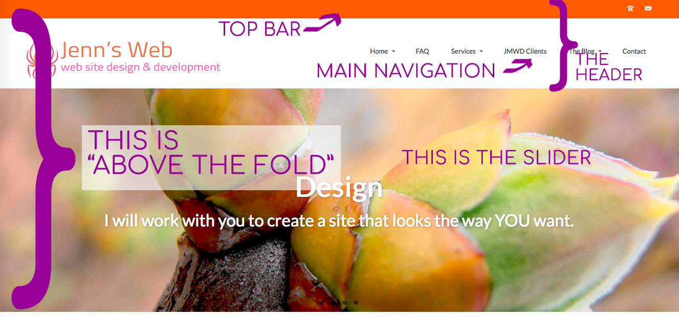
TOP BAR NAVIGATION
Many times a website calls for having a row at the very top of the page that includes some key contact info like a phone number, an address and/or social media icons. When these items are at the very top of the page, then they are usually included at the top of the screen when the site is viewed on a mobile device.
HEADER
The area of the page that goes from the Top Bar Navigation to the Main Navigation and includes the site’s name or logo is usually called the Header
MAIN NAVIGATION
Main Navigation can go in a variety of places within the header, but it is the menu that includes the main pages for the site. (Home, About, Contact Us, etc)
SLIDER
A feature that has become very popular in recent years is a series of sliding images just below the header that can show various areas of service, newest blog posts or newest products. This is commonly referred to as a “Slider”. It can be coded into your theme directly or it can be powered by a plugin such as Smart Slider3 (one of my favorites). An effective slider should have a link to something within the site that you want your site’s visitors to go to quickly. It should be an image that grabs people’s attention and quickly gives them a sense of the purpose of your site.
A similar concept is called a “Hero Image”. This refers to a large image at the top of the page that doesn’t change, but carries the main concept of your site.
ABOVE THE FOLD
This is the area of a site page that is immediately visible to a visitor when they land on that page without scrolling down. This is where you need to place your most impactful content, your most striking image, the main link that you want your visitors to click on.

CONTENT
The content section of your page is where you put the text and media for that particular page (or blog post).
SIDEBAR
Many times a site’s design will include one or more sidebars. These are areas of the page that can either contain specific widgets for that page, or the same widgets throughout the entire site.

WIDGET
A widget is an individual area on your site that contains a specific function. Depending on your site’s theme, widgets can be in the header, on the side of the page or in the footer. WordPress has some standard types of widgets such as the Text or HTML widget (handy when you want to have a custom script or embed something from another site), a contact form or your most recent blog posts.

FOOTER
The area in the bottom of the page (usually there are some widgets there as well) is commonly referred to as the “Footer”. I usually try to keep some useful info in that area such as a contact form, social media links or use it for advertising.
And there you have it. A rough guide to a web page. No more “Huh?” when you hear about sliders and widgets!