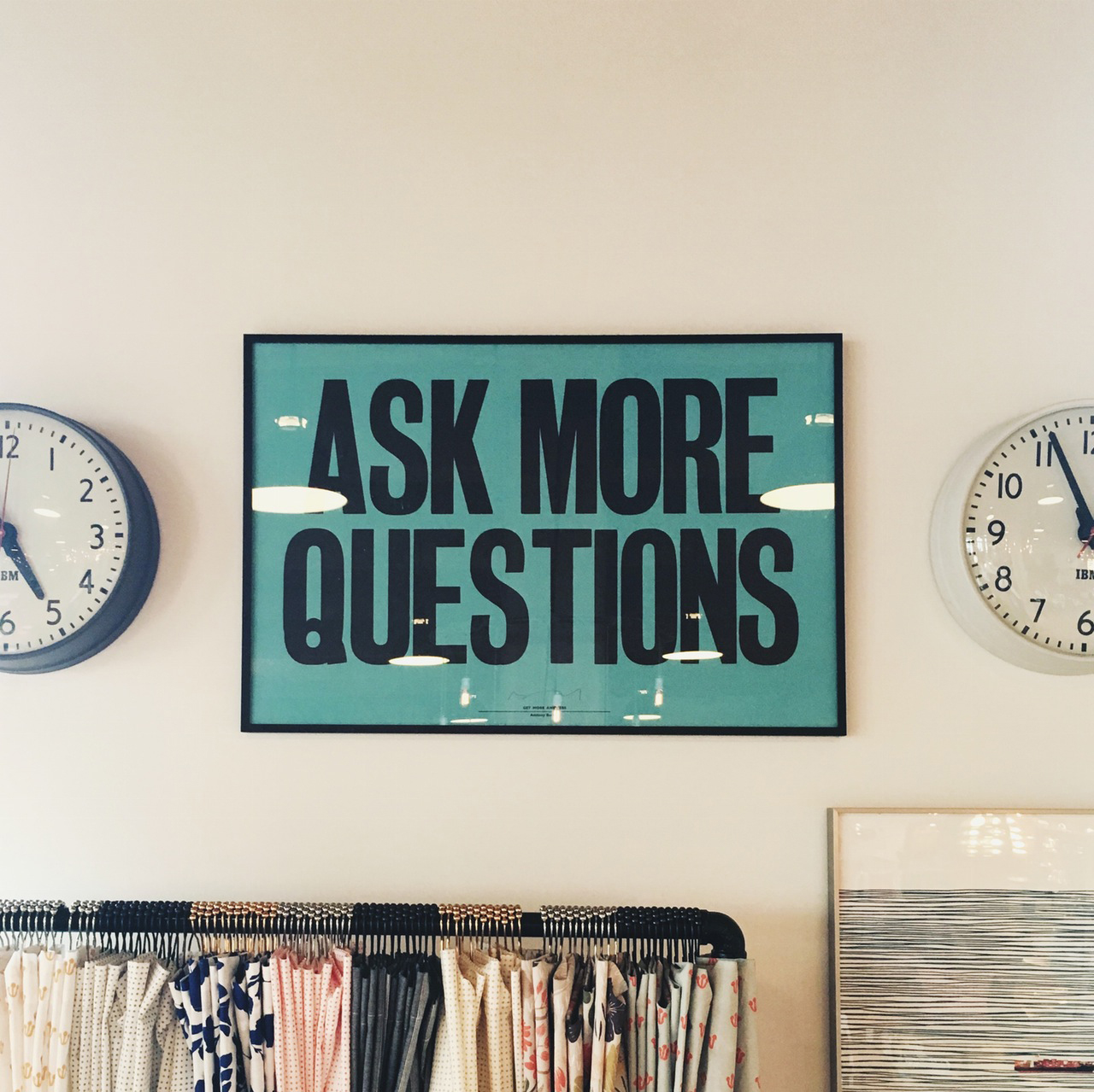
Teaching is not the mere imparting of knowledge but the cultivation of an inquiring mind.
Jiddu Krishnamurti
One: What is a FAQ?
FAQ stands for Frequently Asked Question. It’s something that your clients seem to always be asking you. It could be as broad as “What does a web designer actually do?” to as specific as “What kinds of questions should I have on a contact form?”
A FAQ should be useful information that your readers will find relevant. For example:
Question: What does SEO mean?
Answer: Search Engine Optimization is the practice of setting up your website to be easily indexed by a search engine (Google, Bing, Yahoo) and building your pages in such a way that a search engine will judge the page’s content to be a good match for any keywords that your intended audience would use.
A FAQ should NOT be a blatantly self-promotional marketing piece such as:
Question: Where did you find the time to develop such a great plugin?
Answer: Are you kidding me? I clicked on your company’s FAQ page because your plugin’s documentation is non-existent and now all I find is self-serving drivel? Your user rating just went down another star my friend.
Two: Does my site really need FAQs?
Not every site needs a whole page of questions. If you think they won’t really add anything to your users’ experience on your site, don’t worry. Just be glad that you’ve chosen a line of work that people find self-explanatory!
Sites that could really benefit from a FAQ section include:
Legal Services
Medical or Dental Offices
Insurance Firms
Companies offering multi-tiered services such as shipping, consulting or design work.
Three: What’s the best way to show the FAQs on my site?
There’s really no “standard” way to display FAQs on your site. My rule of thumb with a client’s site is really based on the anticipated number of questions. Here’s a few scenarios to help you decide:
1: Use a slider
This is a visually compelling way to display a few (1-4) questions. Nowadays you can’t swing a cat without hitting a theme that comes with a big juicy slider for the home page. Use it to pose useful questions that make your audience want to find out more about what you do. An example could be a slide with the question: “What is the difference between a Designer and a Developer?” and that slide links to a page that outlines your services.
2: A page with questions and answers as a list
I would recommend using this approach if you have anywhere from 1-10 questions with fairly short answers. No one wants to scroll endlessly down a page scanning frantically for something that is close to what they want to know.
3: Use a jQuery accordion
There’s a lot of WordPress themes that come bundled with a way to feature an “accordion” section on a page. It’s basically a script that powers a feature where your question is in a box with a plus sign or down arrow that prompts the reader to click the box to trigger a dropdown section revealing the answer. This is great when you want to present a pretty good size list but conserve on space.
[accordion]
[pane title=”What the heck is jQuery?” start=open]
jQuery is an online script library that enables your site to have cool stuff like sliders and popup windows and accordion tabs without needing to include a ton of messy coding on the page. Instead, your site simply “requests” the script from a library and then executes that script on your site.
[/pane]
[pane title=”That sounds fun! Where can I learn more?”]
Visit jQuery.com and knock yourself out!
[/pane]
[/accordion]
4: Use a Search plugin to help readers ask their own questions.
This comes in very handy when you really can’t pinpoint questions people might come up with but you know that you have plenty of content that can handle most of the questions people may have.
Here’s one that might fit the bill.
Four: I just started my business and I don’t know what my FAQs are yet!
Don’t worry, just get creative! It’s a little tricky to come up with questions without being too general or too “market-y” but it can be done and a side benefit is that it gets you thinking like your customers. For example, instead of simply putting a call to action in your footer like “Click here to schedule a free consultation!” you could have a FAQ on your page like: “Do you offer a free initial consultation?”
Fun fact about FAQs: When it seems like you are offering up free information, people are a lot more likely to appreciate it and act on it as opposed to presenting that same information as blaring Call to Action in a pop up ad.
Five: I’m still so stumped. What should I do?
When in doubt, search it out! You can always check out what similar businesses to yours are doing and get some “conversation starters” there. Just make sure that you re-write questions and answers in your own voice so you don’t get flagged plagiarism. Have fun with it!


